 |
 |
 |
 |
Introduction
The Barcelona Climate Change Challenge has been my first competition, and our team ended in the 1rst Place: so it has been a great day and a great beginning. In this competition we had solve two different tasks:
- 2016 daily temperature prediction
- Establish positions for 10 new sensors around Barcelona
It has been a great opportunity to test my machine learning skills but also to learn new concepts and ideas about time series prediction and sensor placement.
Data
The data consisted in weather related variables for four locations in Barcelona. The data was or dairy or hourly data, since 2012 until the end of 2015. An example of the variables found, among others, can be seen on the following table:
| FIeld | Unit | Description |
|---|---|---|
| Tx, Tn, Tm | ºC | Maximum, minimum and average temperatures |
| hPa | hPa | Máximum Preassure |
| PPT24 | mm | Rain milimeters |
| HRm | % | Minimum Relative Humidity |
| VVem6 | m/s | Average Wind Speed at 6 meters |
| DVum6 | graus | Wind Direction at 6 meters |
| VVx6 | m/s | Maximum Wind Speed at 6 meters |
| vDVx6 | graus | Maximum WInd Speed Direction at 6 meters |
The four locations chosen were the four official climatic stations of Barcelona:
- Observatori Fabra
- Zoo
- El Raval
- Zona Universitària
However, there were also unofficial stations that could be used for prediction tasks. The information of the unofficial stations was similar, including variables such as the altitude but only having the maximum and minimum temperature for the place. In the next figure one can observe the positions in Barcelona of the official stations, in red, and the unofficial stations, in green:

Temperature Prediction
The first task consisted in predicting the temperature for Barcelona for each day during the year 2016. The idea was to use the variables given but we could add more variables from other sources.
In total we had 112 features coming from all the stations, official and unofficial, and hourly and daily data. To be able to select the best model altogether with the best variables we followed the subsequent procedure:
- Select best variables with K-Fold cross validation and a Linear Regression. PCA included.
- We started with the obviously best variables, temperatures from the official stations, and incrementally added more features. When the data passed 20 features we started including PCA as an option.
- Test different models with the selected features.
- Carry hyperparameter optimization with Bayesian Optimization library Hyperopt [1].
All the process has been carried out using Pandas, Numpy, Scikit-Learn and Matplotlib.
For the first step, we based our selection of initial features on correlation plots, such as the following image:

where we see that variables such as solar radiation have an important correlation with temperature.
After all this process we ended up with the best model for our process and data: Linear Regression with 5 features. The features were the temperatures from the 4 official stations and the day of the year (numeral).
We tried to add mroe data but the model was pretty sensitive to new information: results worsened every time we added a new feature. This could mean that or the information added provided more noise than relevant information or that the model was not stable.
One example was to try to add green coverage of Barcelona as a new feature. The reason was that we saw it, visually, had a certain resemblance to the error produced by the model. In the next figure, on the left we can observe the green coverage and, on the right, the error produced by the model.
 |
 |
Another point that we noticed is that the distribution of themperatures was not lineal, and using a linear model, we lost the possibility to cover certain parts of Barcelona. In the next figure, on the left, we can see a heatmap of the mean minimum temperature of Barcelona, and on the right, we can see the average mean temperature of all Barcelona and the one from the official stations.
 |
 |
On the figure of the left, we can appreciate that the zones in the up north of Barcelona are way colder than other parts of Barcelona. In the image on the right we can observe that the distribution of mean temperatures losses its linearity in the colder temperatures. If we relate this to our error image, we can observe that there is where our model produces the greater error. Hence, instead of using a simple linear model, we could have better off used a polynomial model to cover those non linear effects.
With all this we have been able to predict the Barcelona temperature with an average daily error of 0.5 ºC approximately.
Placing new sensors
This task consisted in the following question: if you had to place 10 more sensors in Barcelona where would you locate them? Remember that we had 4 official sensors already.
In this case the data was different compared to the first task. Now Barcelona, instead of being a whole, was a grid of 10k points approximately. In the last image we can observe the new grid as the Barcelona scattered shape, where each grey dot is a possible point.
However, to evaluate the placement of sensors a restriction was established. The temperature prediction for each grid point had to be a linear combination of the temperatures of all the already placed sensors. That is:

where p indexes the point and i indexes the sensors. Hence, the temperature for each point had to be computed as a linear regression. The explanatory variables were then the temperatures from the official and added sensors.
In our case, we first were tempted to apply Bayesian Optimization (BO) to obtain the new points. The problem is that the points to choose were indexed from 0 to 10213 but the geographical correlations were not given. That is, indexing the points incrementally made no sense since there was no geographical in this order. We then discarted this procedure, although it could have been promising to make a 2D BO process (the grid is not squared, points should be reordered and positioned incrementally along the axis,…)
The proposed solution was far simpler: we want the new sensor to help us predict better the temperature of other points, that is, decrease the error. Then, it is logical to place the sensor where the model has the greatest error.
The pseudocode would be something like:
- i sensors already placed
- While i<N (N total sensors)
- Evaluate the model with j sensors
- Check point with greatest error
- This point is a new sensor , i +=1
- While i<N (N total sensors)
With this procedure we placed the new 10 sensors. In the next figure, it can be observed the order and the position where they were placed:

This placement raised two main questions:
- Why the new sensors were placed at boundaries?
- Do we really need to place all the ten sensors? Do we need more?
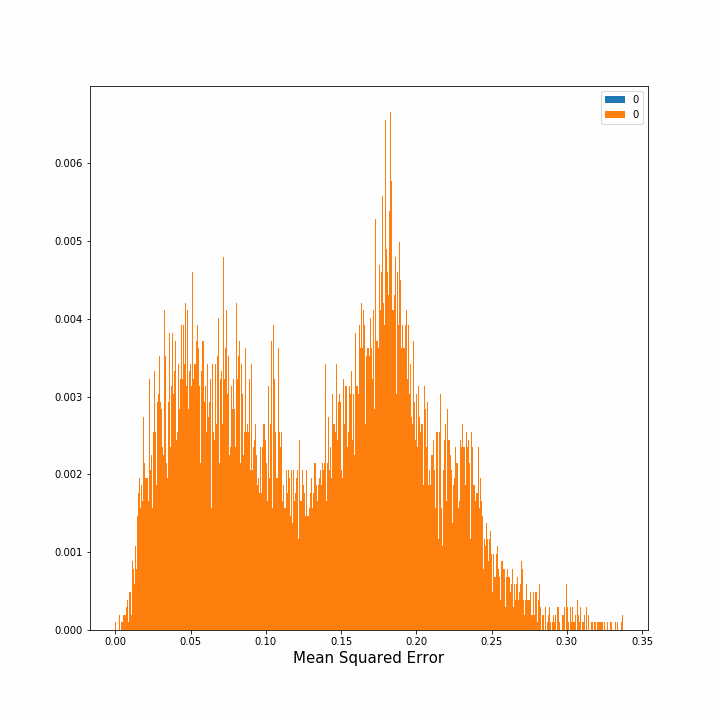
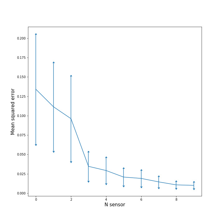
Hence, we computed how the error diminished as we continued to put more sensors in the grid. In the image on the left, the evolution of the density of errors, that is the percentage of points with error x, is plotted after each new sensor placement. In the right image we can see the mean average squared error for all the points and its standard deviation after each step. The image on the right is interesting since we can observe that the benefit of adding one new sensor decreases substantially after the third sensor. This figure extended to more sensors could indicate how many sensors should we place until obtaining redundance.
 |
 |
One important drawback of this strategy is that we are placing the new sensor where the maximum error exists. That does not necessarily mean that the place is correlated with its surroundings and could be beneficial for predictions. Hence, including in the selection process a correlation measure would be beneficial.
Now, we would not be selecting the point with greatest error but a point with a trade off between the error and the correlation with its viccinity. In the next image we see the error for each point plotted against the correlation value of each point (for the mean daily temperature) with respect all the other points. As seen we were choosing the point with the greatest error, the one on the far right. Maybe choosing a point marked with a star, which had a greater correlation with others, would have been a better option.

Another interesting comment is that almost all points were placed on the margins of the map. This might be due to the contour conditions of the original model which generated the temperatures. An interesting step then would have been to forbid the marginal areas for sensor placement.
Conclusions
In this competition we have been able to test our ML skills for classic tabular data but also for spacial optimization problems. In the first task we have been able to predict the temperature with an approximated average daily error of 0.5 ºC. Furthermore, an important lesson has been taught, Keep it simple as possible: the linear regression model was the best one. I would have loved to test Auto-Sklearn from the AutoML group [2], but maybe for another ocassion.
In the second part we have also obtained a similar conclusion. Although good and powerful methods might exist, sometimes the best solution is the simplest one.
References
